Whispered Luxury: Mastering Near‑Match Hues and Tactile Layers

Today we explore tone-on-tone color schemes and texture pairings for subtly luxurious rooms, celebrating nuance over noise. Expect practical guidance, lived-in anecdotes, and designer tricks that reveal how small shifts in value, sheen, and touch can transform familiar spaces into deeply comforting, quietly elevated sanctuaries without shouting for attention.

The Language of Undertones

Undertones are the whisper beneath your chosen color, steering it warmer or cooler in ways you notice most when hues sit side by side. Identify them with large swatches, comparing against true neutrals and natural daylight. A coherent undertone family keeps walls, textiles, and finishes harmonious, letting texture become the star without clashing.

Micro‑Contrast with Value Steps

Aim for measured differences in lightness—enough to register, never enough to fracture the serenity. A five-to-ten point Light Reflectance Value gap between adjacent surfaces often reads as intentional depth. Door trim slightly lighter than walls, a headboard a touch darker than drapery, and a rug bridging both create movement that remains soothing.

Texture as the New Color

When hue differences are minimal, touch and light carry the narrative. Rough against smooth, matte against soft sheen, nubby against flat—these juxtapositions summon depth while staying within one color family. We will pair fibers, minerals, and finishes to generate shadow play, highlight edges delicately, and keep the eye wandering with quiet curiosity.

Matte, Eggshell, and Satin in Dialogue

Gloss changes how we perceive color. A satin door within a matte wall feels lighter without changing the paint. Eggshell softly lifts architectural details while avoiding glare. Place higher sheen where light skims—panels, molding, cabinet faces—and keep wide planes calm. The interplay yields definition that honors subtlety, not spectacle, and invites relaxed focus.

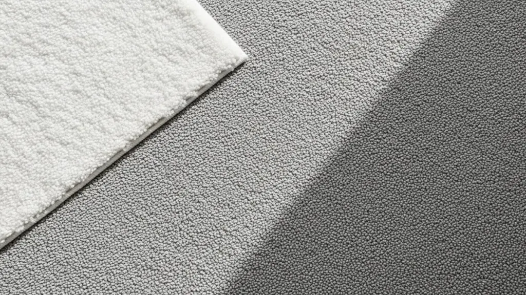
Wools, Linens, and Bouclé with Purpose

Natural fibers absorb and scatter light, lending hushed luxury to restrained palettes. Linen wrinkles elegantly, signaling ease; wool felt anchors with dense warmth; bouclé adds friendly texture that photographs beautifully. Combine tight weaves with looser knits, and vary pile height across upholstery, pillows, and throws to create rhythm that feels organic, never forced.

Grain, Vein, and Pores

Wood grain, stone veining, and open-pored ceramics introduce subtle movement that reads as depth rather than noise. Choose species and cuts whose undertones echo the room’s palette—oaks for cooler grays, walnuts for mellow taupes. Honed finishes diffuse reflections, while light wire-brushing catches shadows, making monochrome compositions feel tangible, crafted, and comfortingly real.

Layering that Lives Well

A quietly luxurious room must function beautifully. Layering is not stacking; it is sequencing. Start with large, calm fields, then add scaled textures, accent contours, and touchpoints that feel good in daily use. The result is a space that welcomes wear, rewards attention, and ages with grace rather than growing precious or fussy.

Light: The Invisible Pigment

Light edits color continuously, changing perceived value, warmth, and sheen throughout the day. Instead of fighting it, choreograph it. Map daylight, layer sources at multiple heights, and calibrate color temperature to respect your palette. With control, tone-on-tone schemes feel nuanced at noon and soulfully intimate at night without losing their reassuring continuity.

Daylight, Orientation, and Sky

North-facing rooms favor cooler, stable light that preserves grays and mutes warmth; south-facing spaces swing dramatically from golden midday to moody evening. Test swatches on every wall, morning and dusk. Note where shadows pool and highlights skim—those zones deserve texture emphasis so the palette maintains dimension as the sun arcs and retires.

Evening Layers and Dimmers

Use a trio: ambient, task, and accent. Dim-to-warm LEDs soften grays and taupes as brightness lowers, keeping skin tones flattering and fabrics velvety. Sconces graze texture; table lamps pool hospitality; picture lights gently crown art. Dimmers make one palette perform many moods, giving tonal rooms a cinematic range without ever changing their wardrobe.

Metal, Glass, and the Bounce Factor

Small reflective surfaces are powerful in restrained palettes. Brushed metals distribute soft highlights; antiqued mirrors blur reflections into atmospheric glow; smoked glass darkens edges elegantly. Keep finishes cohesive and subdued, using them where light naturally lands. The goal is not sparkle, but a quiet glimmer that traces form and flatters every material neighbor.

Stories from Real Rooms

Principles come alive in lived spaces. These snapshots from client projects show how small, thoughtful moves accumulate into rooms that feel restful, indulgent, and personal. Each example uses near-match hues and purposeful textures differently, proving there is no single formula—only a shared devotion to nuance, comfort, and enduring, human-scaled beauty.

A Small Studio, Expanded Quietly

We painted walls and ceiling one soft mushroom, then wrapped a column in tone-matched limewash to add movement without contrast. A wool bouclé loveseat, linen sheers, and a satin-lacquer tray created three gentle sheens. The client reported fewer visual distractions and a sense of space “stretching,” even though nothing physically moved or grew.

A Primary Bedroom, Serene but Rich

Headboard upholstery matched the wall two values darker, letting bedding textures carry interest. Flanged linen shams, a quilted coverlet, and a cashmere throw formed a tactile trio. Bronze picture lights warmed artwork, while a pale oak nightstand echoed cool undertones. The couple slept better within a palette that whispered instead of performed.

A Powder Room, Spa‑Grade Subtlety

Honed limestone with feathery veining met microcement walls tinted to the stone’s lightest note. A matte black faucet punctuated without breaking the calm. A small antiqued mirror spread candlelight into a gentle halo. Guests described it as “quietly expensive,” a testament to controlled value shifts and deliberate material honesty, not flashy finishes.

Your Toolkit and Next Steps

Confidence grows from process. Build habits that reveal truth—large samples, varied light tests, tactile mockups—and keep notes on undertones, sheen, and LRV gaps. Start small, iterate, and share results. The most satisfying tone-led spaces evolve over weeks, not hours, becoming personal signatures that welcome you home every single day.

Swatch Rituals that Reveal Truth

Paint two coats on oversized boards, label with undertone notes, and test across walls, corners, and ceilings. Pair each swatch with fabric and floor samples to judge interactions. Photograph morning, noon, and night. Track preferences against light and activity patterns. Let data guide intuition until your palette clicks with reassuring, repeatable clarity.

Starter Palettes to Customize

Try a cool gray ladder with gentle blue undertones; a warm greige family grounded by taupe woods; or a sandy neutral suite brightened by chalky whites. Keep saturation restrained and values stepping predictably. Fold in one polished accent—perhaps satin metal or glazed ceramic—to catch light. Adjust proportions to your architecture, climate, and lifestyle.
Zazapozefuneranokanima
Privacy Overview

This website uses cookies so that we can provide you with the best user experience possible. Cookie information is stored in your browser and performs functions such as recognising you when you return to our website and helping our team to understand which sections of the website you find most interesting and useful.